Завтра,
Бесплатный доступ к онлайн мастер-классу для владельцев малого и среднего бизнеса
Вы не успеваете всё контролировать, а сотрудники подводят?
 Получите бонус после регистрации: «20+1 шаг от операционного хаоса к системному бизнесу»
Успейте зарегистрироваться
БЕСПЛАТНО
БЕСПЛАТНО
Зарегистрироваться бесплатно
0 :
00 :
00

Что вы получите на мастер-классе?
 Главный фактор повышения
прибыли бизнеса
 Шаблоны инструкций, готовые к применению
 Секреты создания
больших компаний
 Решение 4-х ключевых задач
в бизнесе
 Опыт практика по созданию
растущего бизнеса с нуля
 Инструменты для создания
системного бизнеса
Главный фактор повышения прибыли бизнеса
Шаблоны инструкций, готовые к применению
Секреты создания больших компаний
Решение 4-х ключевых задач в бизнесе
Опыт практика по созданию растущего бизнеса с нуля
Инструменты для создания системного бизнеса

Автор статей в топовых бизнес-журналах:


Успейте зарегистрироваться бесплатно и получите план
«20+1 шаг от операционного хаоса к системному бизнесу» Всего за 21 шаг вы определите, на какой стадии находится ваша компания и куда двигаться, чтобы повысить прибыль своего бизнеса.

«20+1 шаг от операционного хаоса к системному бизнесу» Всего за 21 шаг вы определите, на какой стадии находится ваша компания и куда двигаться, чтобы повысить прибыль своего бизнеса.
Зарегистрироваться
Все участники мастер-класса получат пакет шаблонов и чек-листов, разработанных на основе опыта 2500+ компаний.
Они помогут вам уже сегодня начать строить систему, а не тушить пожары.
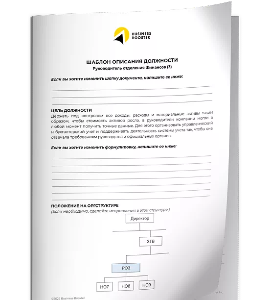
Шаблон: Должностная инструкция Руководителя финансов

Чек-лист: Этапы развития компании

Чек-лист: Какого сотрудника НЕ СТОИТ ставить руководителем?
Черная пятница!
Скидка на участие в онлайн-практикуме «Бизнес Операционная Система»

Только до 28 ноября
Узнать подробнее
Заберите бонус после регистрации —
Пошаговый план «20+1 шаг от операционного
хаоса к системному бизнесу»
хаоса к системному бизнесу»

В нем подробно описаны:
- 5 стадий развития компании;
- 8 бизнес-инструментов и принципы работы с ними;
- 21 шагов к созданию системного бизнеса.
Следуя этому плану, вы сможете получить стабильно работающую систему, свободное личное время собственника, прирост дохода и прибыли бизнеса.
Зарегистрироваться
на мастер-класс
на мастер-класс